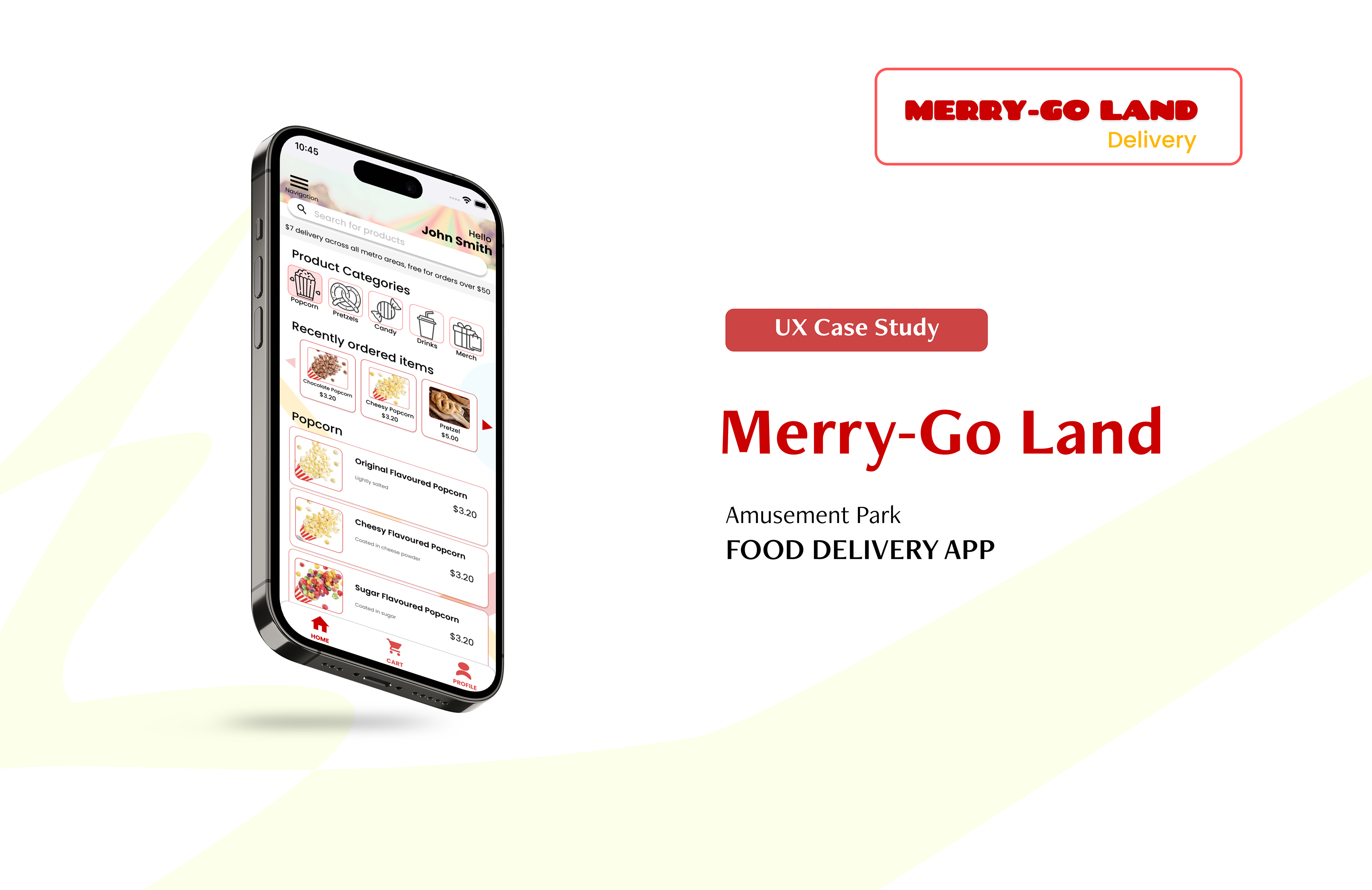
PROJECT OVERVIEW
The Project
This app is designed for an amusement park food vendor so they can deliver food to their customers without the need for customers to attend the amusement park (due to the COVID19 pandemic). The app targets users who do not have the time to attend amusement parks and those that want a slice of the amusement park experience in the comfort of their own home.
The Problem
The amusement park industry, particularly food vendors, has suffered due to the current ongoing COVID-19 pandemic. People also have less time to attend amusement parks due to personal commitments.
The Goal
To design a delivery app that would connect the amusement park food vendors to their customers in a contactless and convenient way.
Responsibilities
- Research into user habits by conducting interviews
- Implementing usability studies
- Paper and digital wire-framing
- Accessibility considerations
- Low and high-fidelity prototyping
- Iterating on designs
- Implementing usability studies
- Paper and digital wire-framing
- Accessibility considerations
- Low and high-fidelity prototyping
- Iterating on designs
Time Frame
March 2022 - June 2022
Programs Used
- Figma
--------------------------
USER RESEARCH
I interviewed participants about their thoughts on an amusement park snack food delivery app and created empathy maps/persona profiles based off the insight gained from the interviews.
Pain points
Health concerns:
The COVID-19 pandemic has forced closure on amusement parks, and even when re-opened, people are still cautious about being in a crowded environment.
Time:
Due to busy lifestyles and commitments, people are unable to spend a whole day to travel to at an amusement park location.
Accessibility:
Some food ordering apps lack accessibility in terms of colour choices, language options and being compatible with assistive technology.
Interface:
Having images of each food option helps users decide without the need to read text heavy menu descriptions.
User Journey Map

Competitive Audit
To help me with my design choices, I conducted a competitive audit on ordering/picking up food from competitors that operate food services within an amusement park. I analyzed 2 direct competitors - New Orleans City Park Carousel Gardens (USA) and Bombora at Jamberoo (Australia). Despite the different countries, it was interesting to see what international companies are offering. I also analyzed an indirect competitor, Domino's (Australia), which is a large pizza chain in Australia and offers pick-up/delivery services.

User Flow

--------------------------
STARTING THE DESIGN
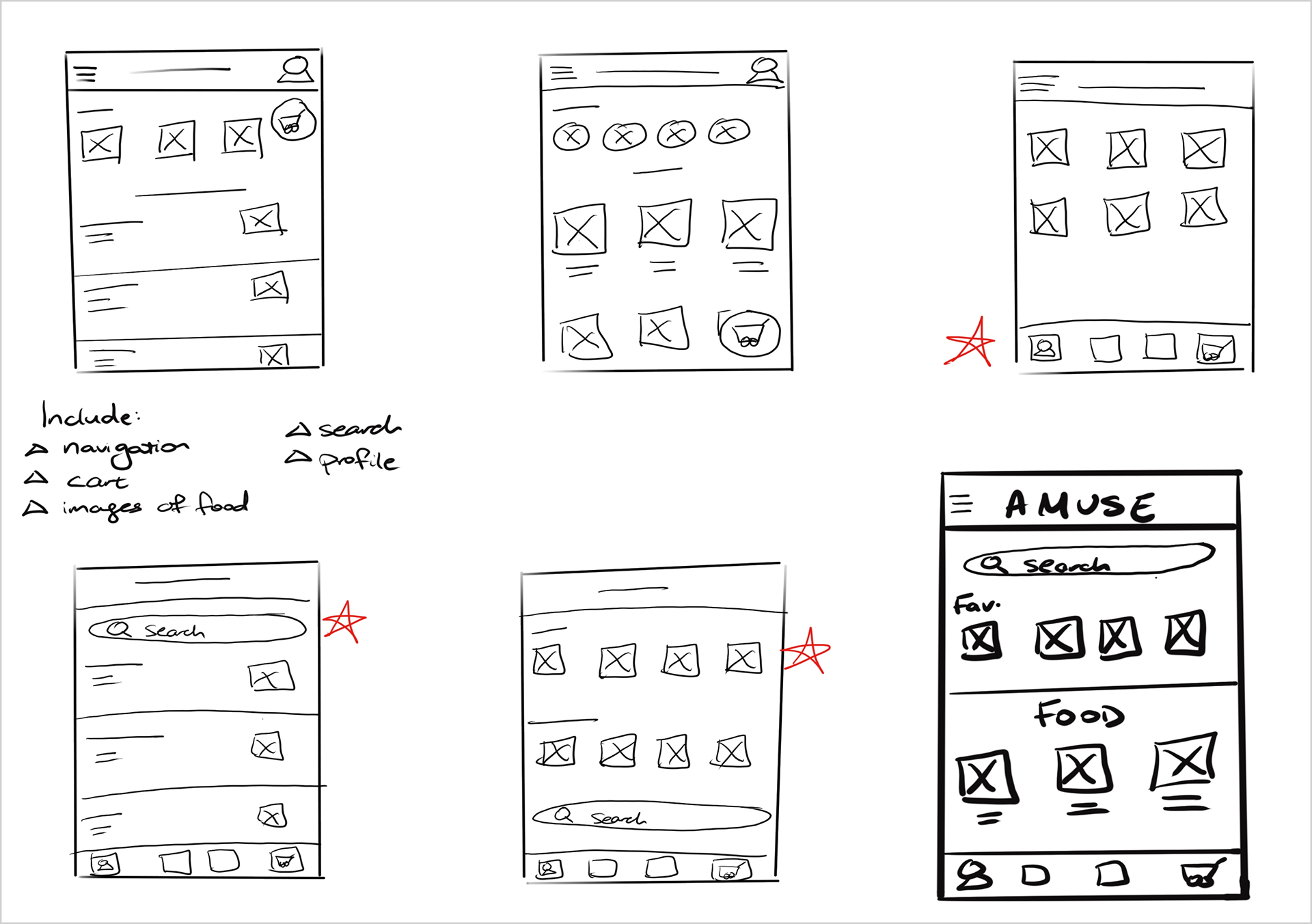
Paper Wireframes
I drew 5 different sketches of what the homepage would look like, and placed red stars on the features that I want to include in the final design. The bolded design is the one I chose to go with that incorporated all the features I wanted.
Throughout my sketches, I played around with placement of elements that I wanted on the homepage of the app including navigation, checkout button, images of food options, a search function and profile page.
Throughout my sketches, I played around with placement of elements that I wanted on the homepage of the app including navigation, checkout button, images of food options, a search function and profile page.
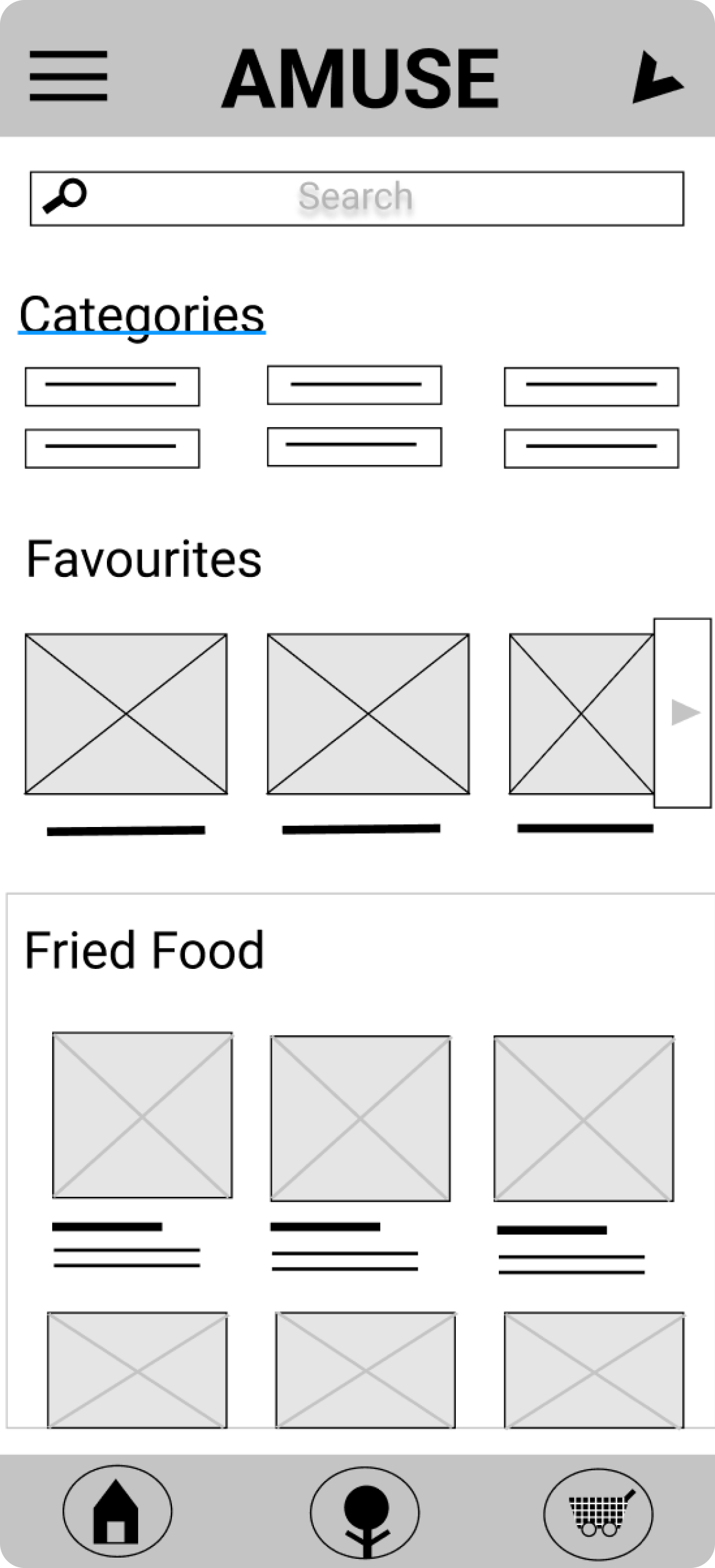
Low Fidelity Wireframes
Features
- Products are split into categories to make for easy and faster browsing
- The app recommends popular items to give suggestions for users on what to order
- The design emphasises the need for a picture based menu so users can visually see their choices rather than reading descriptions
- Navigation tabs are at the bottom so users can click on them where ever they are throughout their user flow

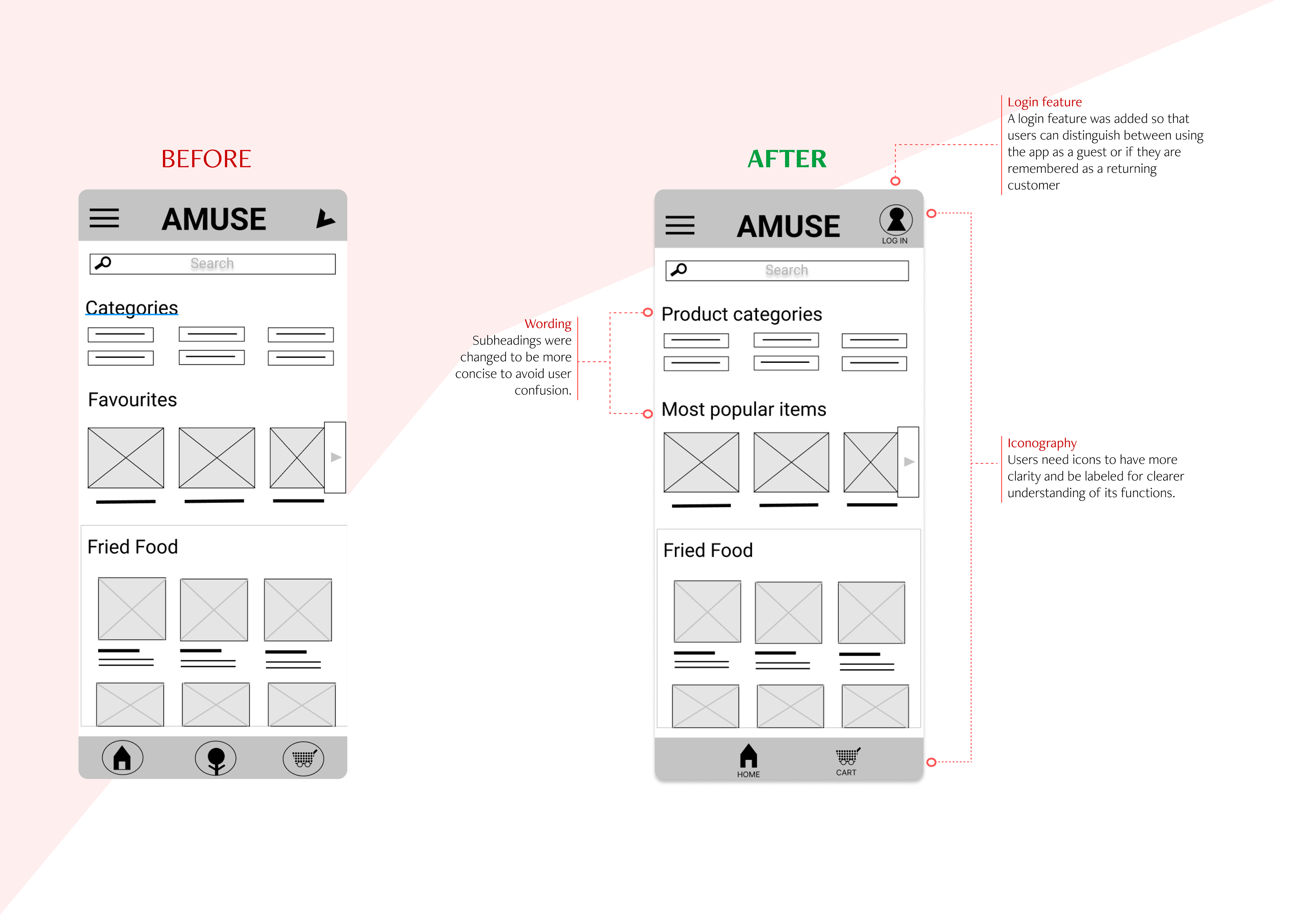
Iterations - Low Fidelity Prototype

--------------------------
REFINING THE DESIGN

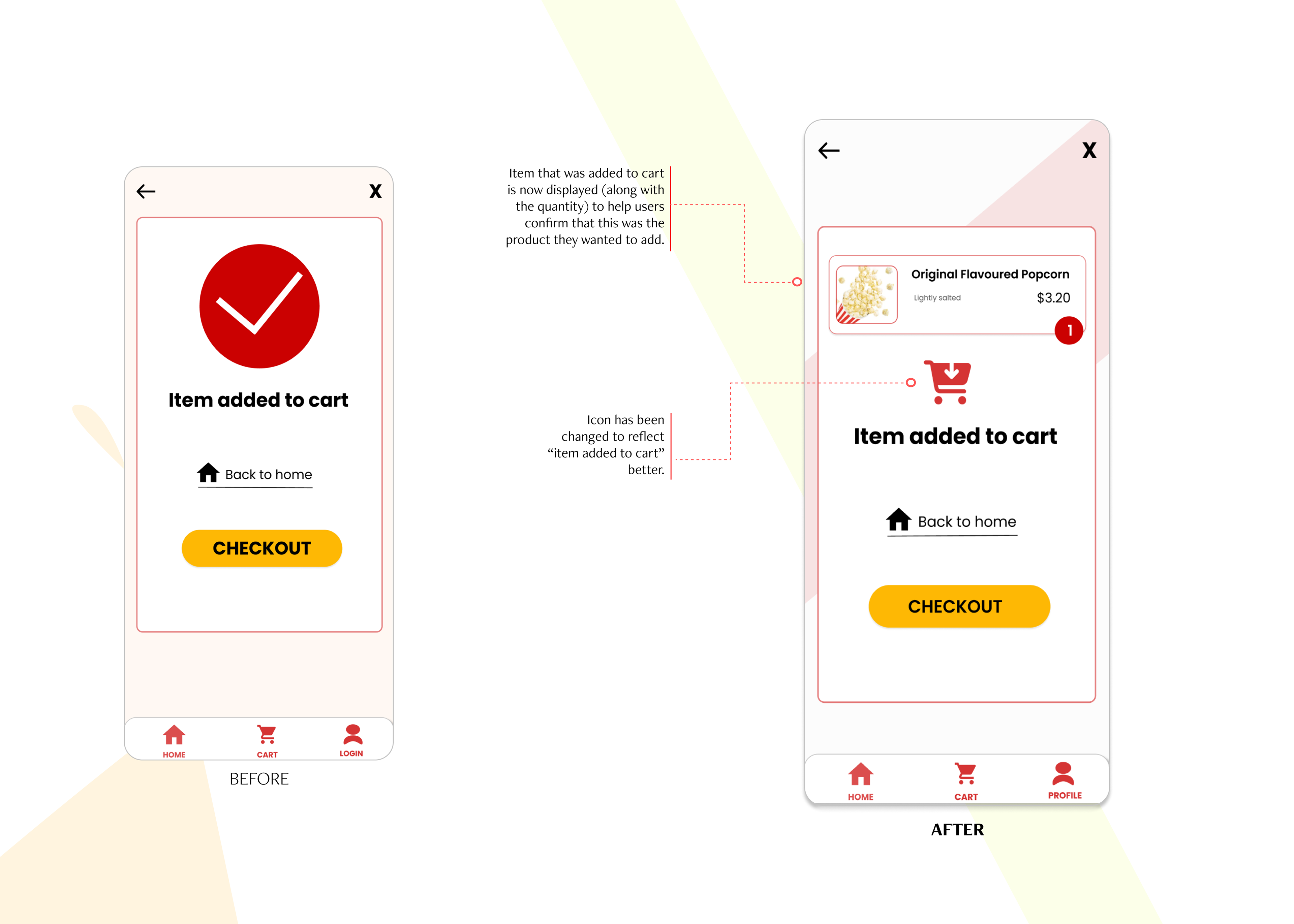
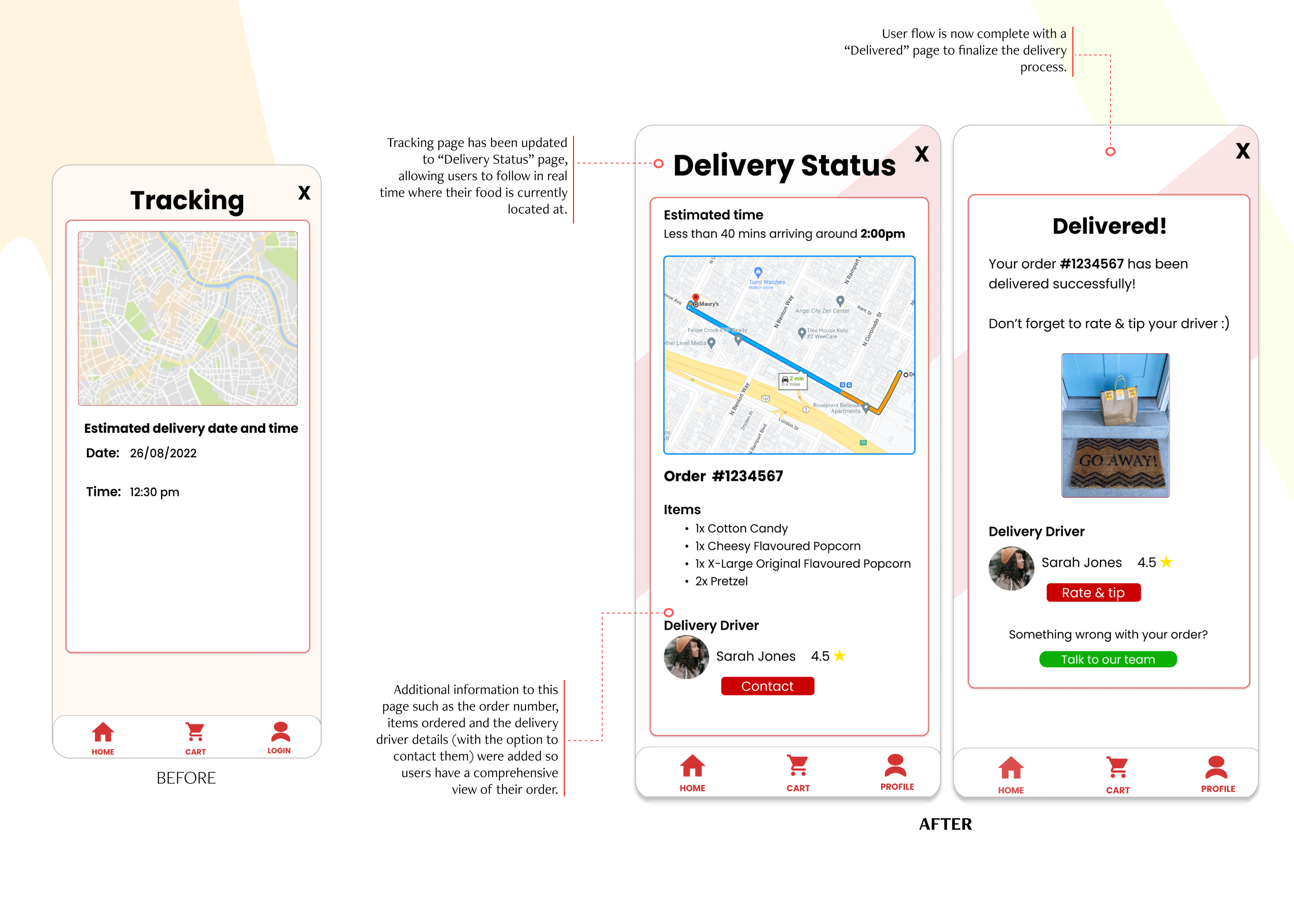
High Fidelity Wireframes
My theme for this project was “amusement park” but that category was very broad in terms of what product the conceptual company would offer. My first design played around with colors that would match a company that sold sweets (blue/purple/pink theme). I was not happy with the initial design and I looked for inspiration from other UX designs that were food based and images around amusement/carnival themes. I decided to go with a red/yellow theme instead and chose the conceptual company to be one that sells items like flavoured popcorn/pretzels as those were the food choices that are often associated with amusement parks.
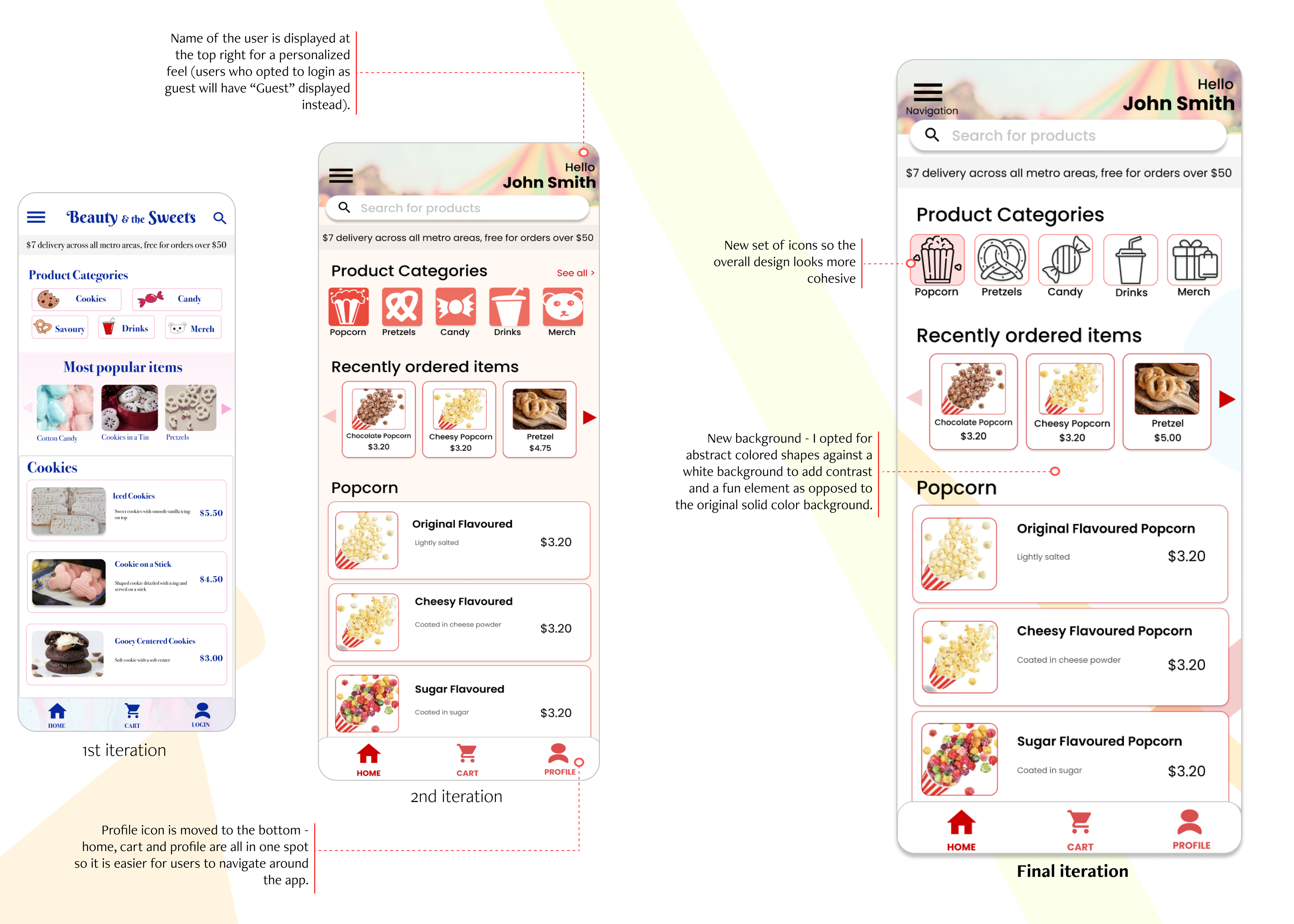
Iterations - High Fidelity Prototype
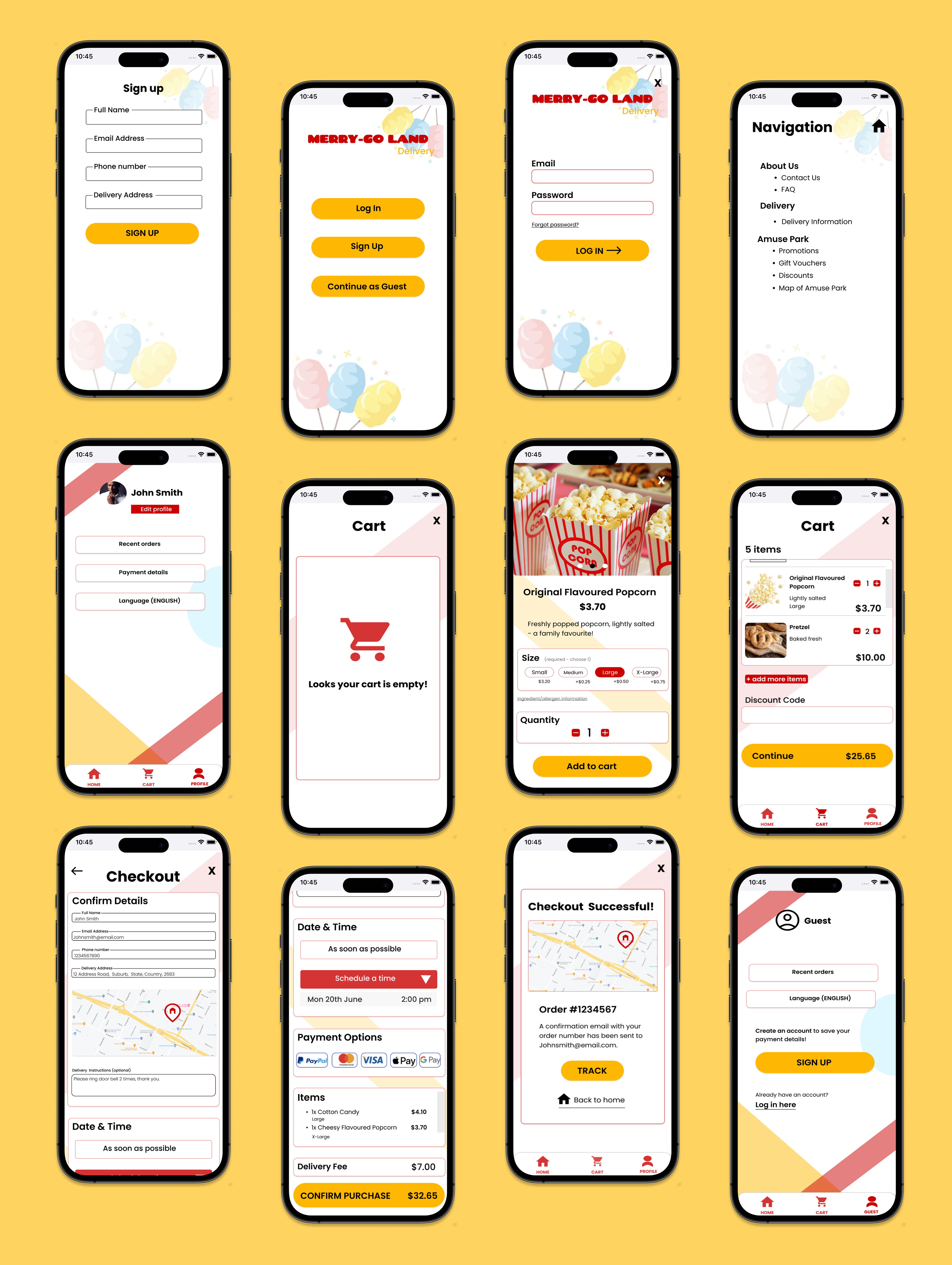
Accessibility Considerations
Labelled iconography: Icons are labelled to help users who use screen readers easily navigate through the app.
Readability: Colour choices in relation to background vs text were all run through a colour tool to ensure readability for everyone.
Imagery: All food items have images to give users a visual cue on products available.
--------------------------
Thank you for viewing!
To view a detailed version of this case study that includes 2 personas, storyboards, completed competitive audit & research plan, please click the button below.