PROJECT OVERVIEW
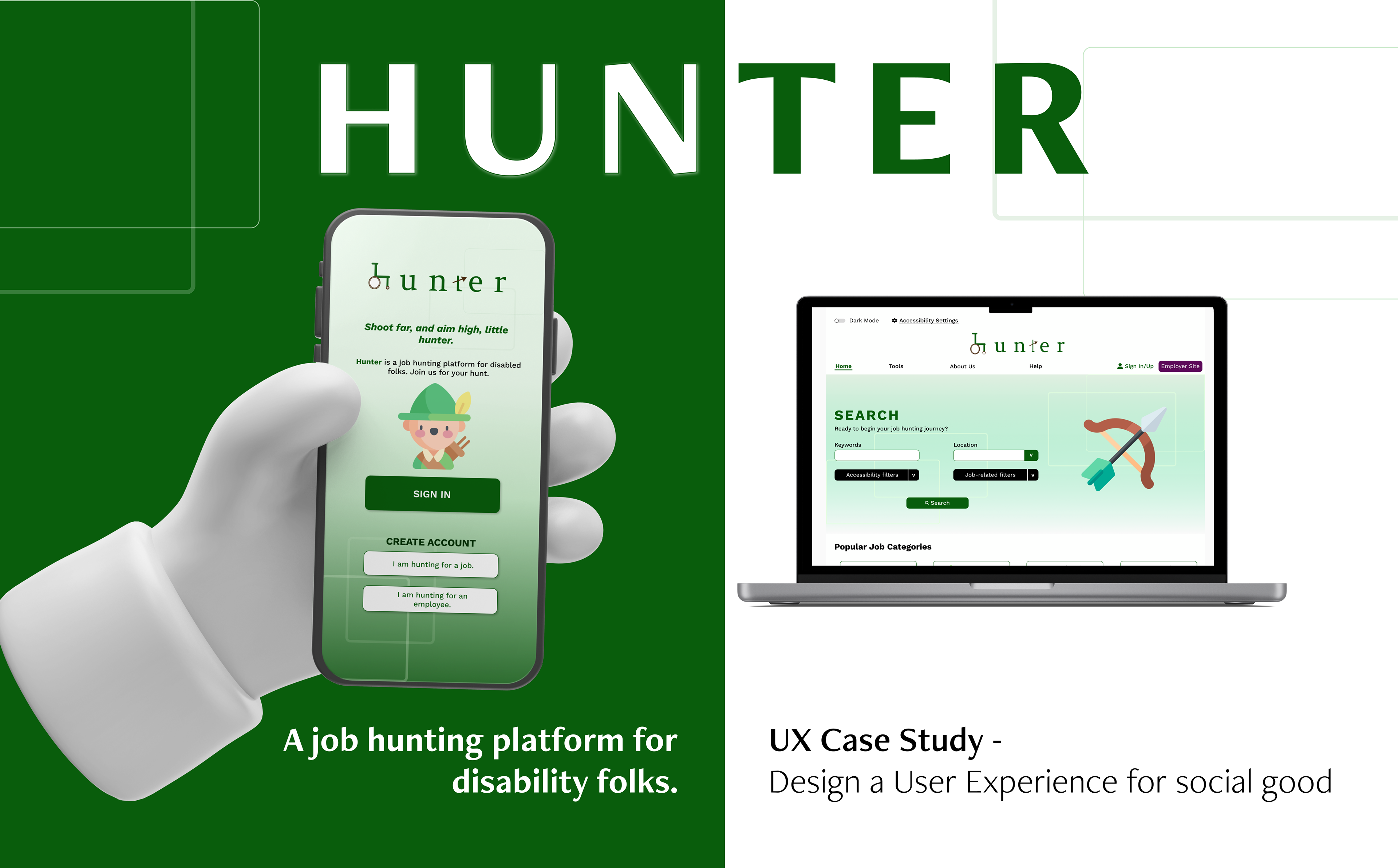
The Project
Hunter’s app & website was created to help users with a disability to have an online platform they can use to look for jobs. Users can choose from a range of filters for different disabilities for their job hunt so they are better informed of workplaces and the disability protocols they have set in place. In contrast, companies that advertise open job positions on Hunter are also well informed they are catering to a disability audience and it is imperative their company has existing accessibility options in place.
The Problem
Majority of existing job seeking platforms are not disability friendly in terms of UI and concept wise. Users with special needs/have gaps on their CV’s due to illness are competing with abled bodied users, resulting in an unbalanced pool of applicants. In contrast, companies do not advertise enough about the disability protocols they have in place and may unconsciously lean more towards an application that comes from an abled body applicant.
The Goal
- To create a platform that will assist disabled users in finding a job at a company that has accessible protocols in place and is willing to be flexible towards their employees.
- To create a platform that companies can use to reach out to disabled applicants and expand their talent pool of employees.
- To design an easy to use app/website that caters towards disabled users by giving them accessibility filters when searching for a job and website/app settings they can adjust to suit their needs.
Responsibilities
- Research into user habits by conducting interviews
- Paper and digital wire-framing
- Low and high-fidelity prototyping
- Implementing usability studies
- Accessibility considerations
- Iterating on designs.
- Paper and digital wire-framing
- Low and high-fidelity prototyping
- Implementing usability studies
- Accessibility considerations
- Iterating on designs.
Time Frame
January 2023 - April 2023
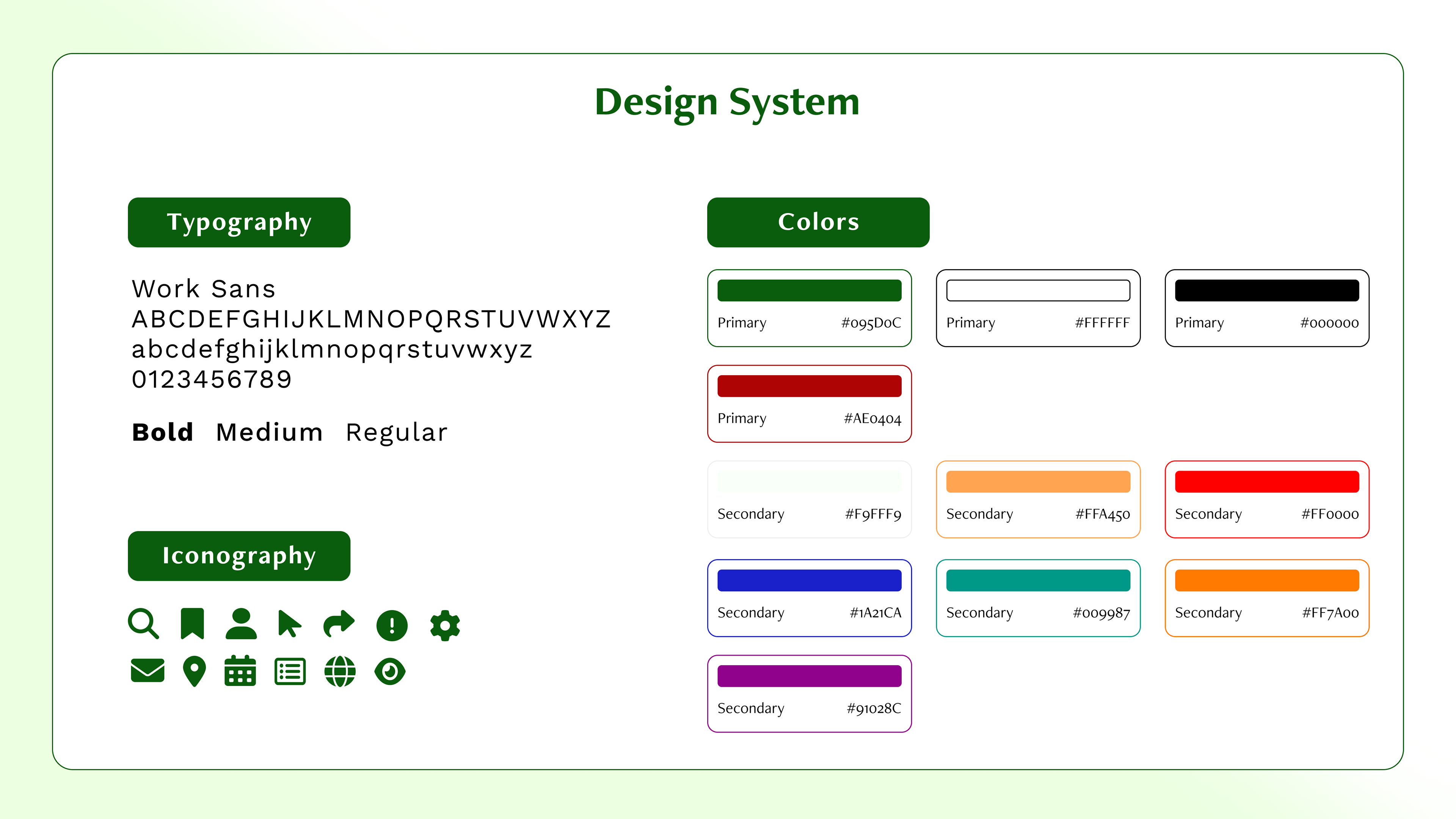
Program Used
Figma
--------------------------
USER RESEARCH
I created an online survey that I invited users with a disability to take in order to gain a better understanding of what problems they encounter during a job hunt and their thoughts about the process as a whole.
Pain Points
Standing out:
A lot of companies may unconsciously lean towards an abled bodied users application without the consideration of hiring a diverse range of employers.
Flexible work environment:
A lot of companies are not flexible towards their employers, whether it is having the option to work from home, or understanding that disabled users need more breaks as they have limited energy compared to abled bodied employees. There is also the question of whether the physical environment of the company is accessibility friendly e.g. are there lifts, or ramps as opposed to stairs?
Gaps on CV:
Disabled users can only explain their circumstances in a cover letter but a lot of companies will only scan CV's.
Limited job search platform:
There are a lot of job seeking agents for disabled people but there is only one platform in Australia that allows disabled people to apply to jobs on their own to companies that are willing to hire from a diverse range of applicants.
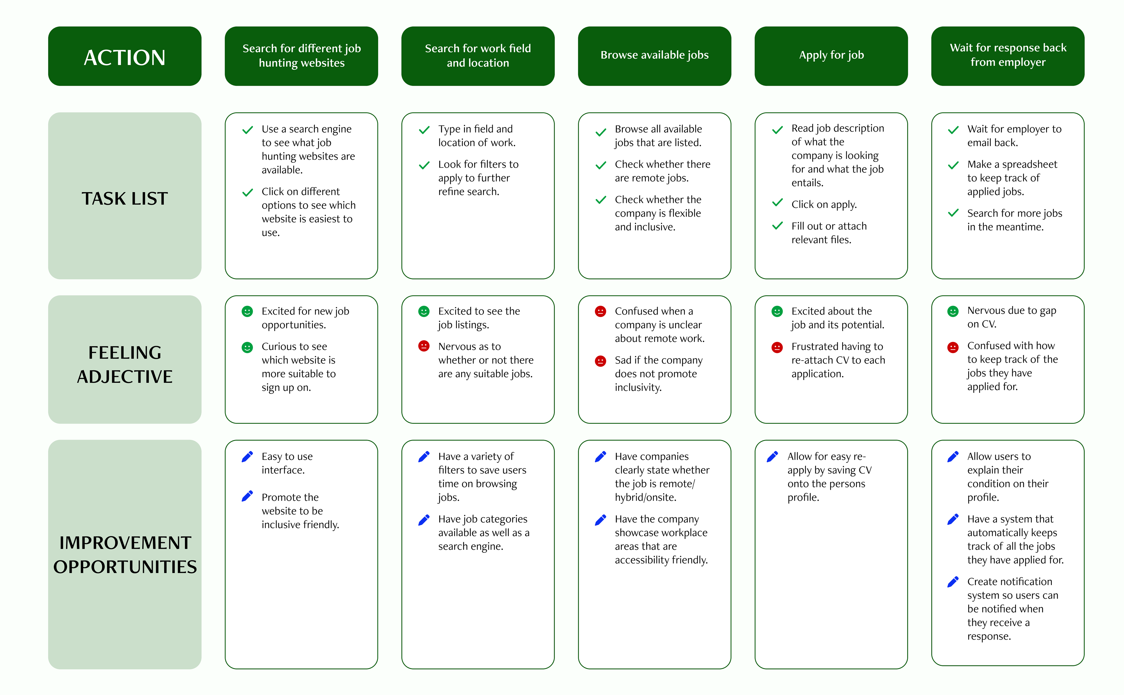
User Journey Map
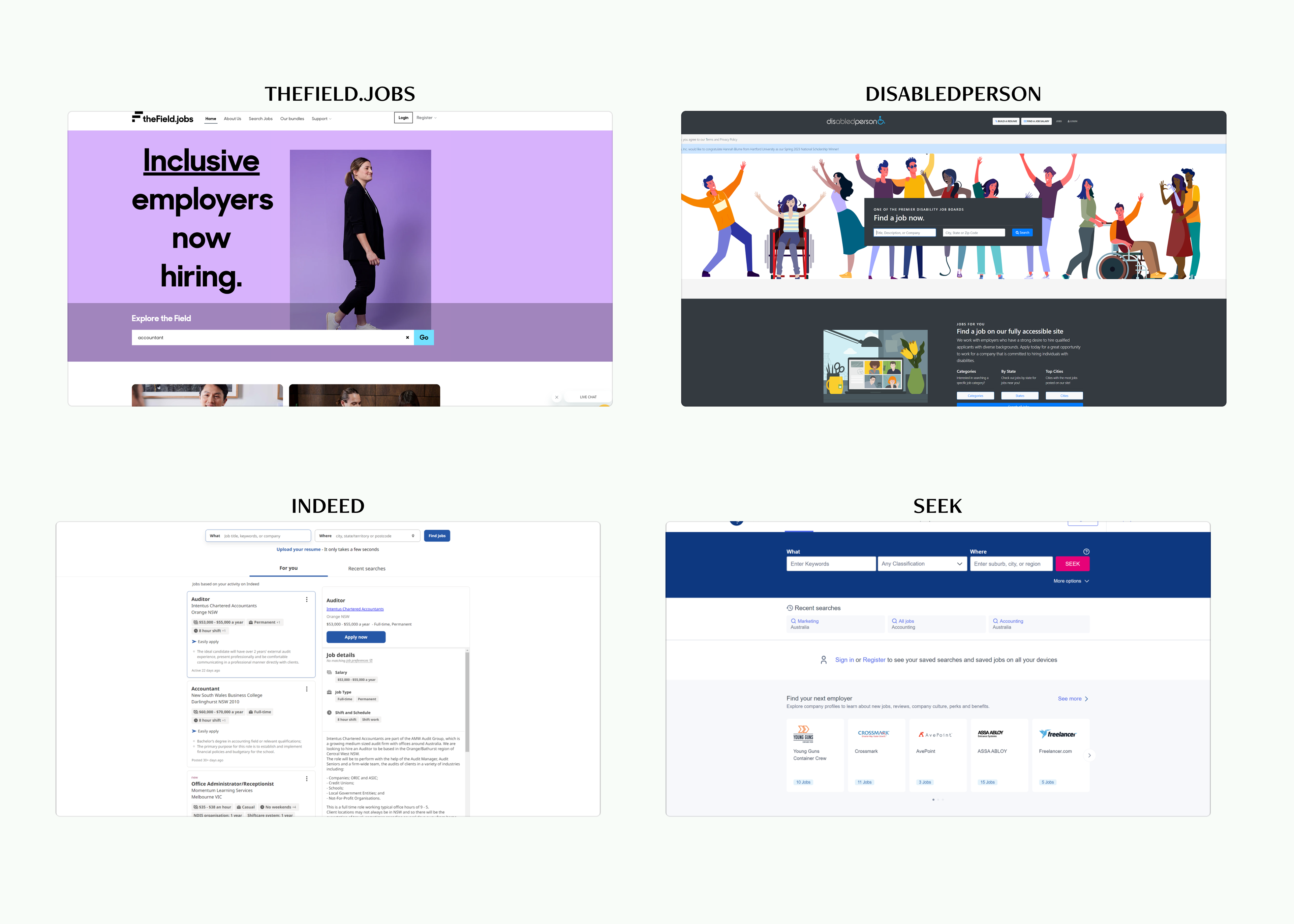
Competitive Audit
To help me with my design choices, I conducted a competitive audit on existing job seeking platforms to compare the job application process and any additional services they provide. I analyzed 2 direct competitors - theField.jobs (Australia) and disABLEDperson (America). Both platforms allow users to look for available jobs/companies that is specifically catered towards disabled people and submit an application to job advertisements. I also analysed 2 indirect competitors - Indeed and SEEK - both are widely used job seeking platforms for the general public.
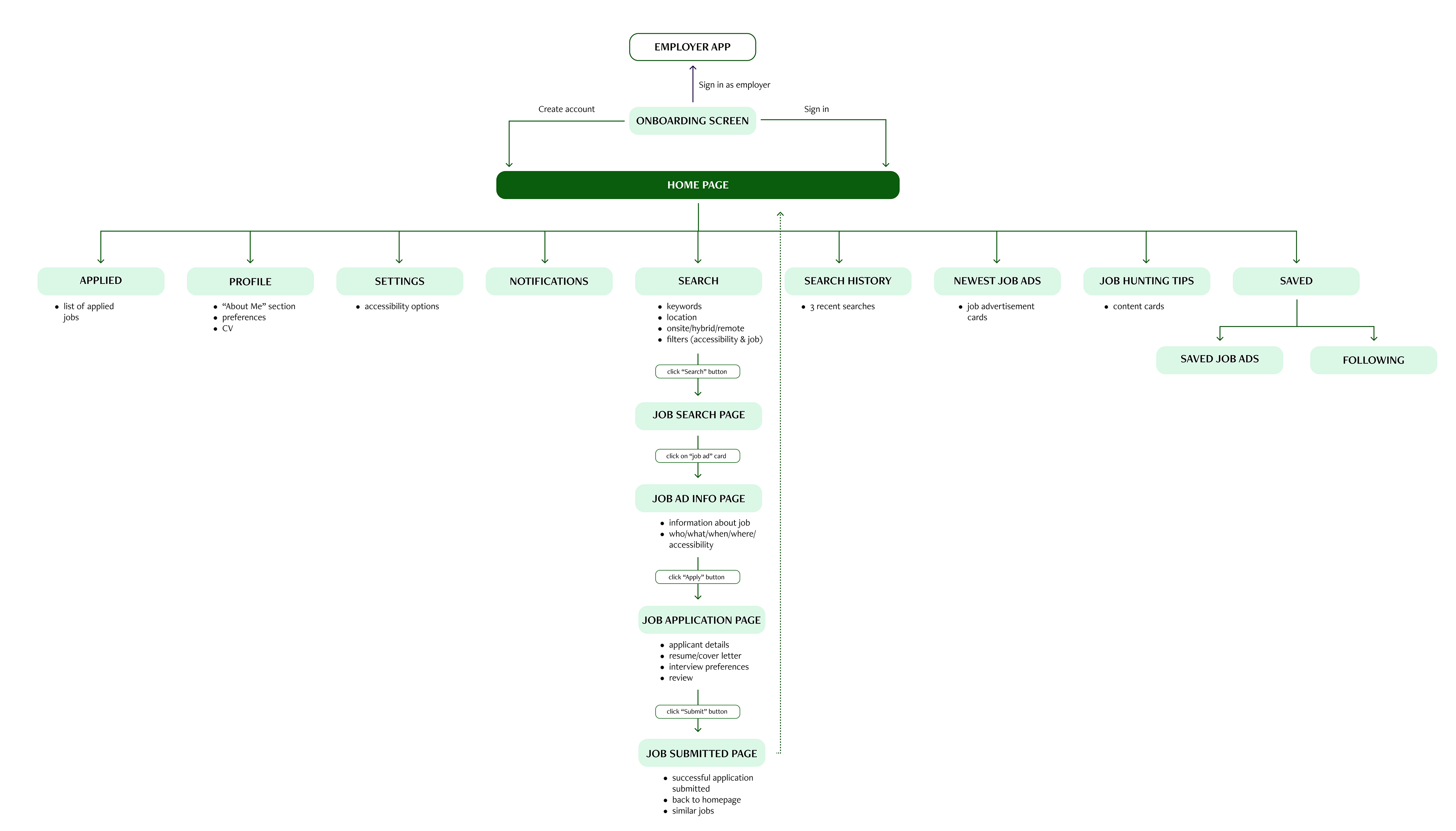
Information Architecture/User Flow
--------------------------
STARTING THE DESIGN
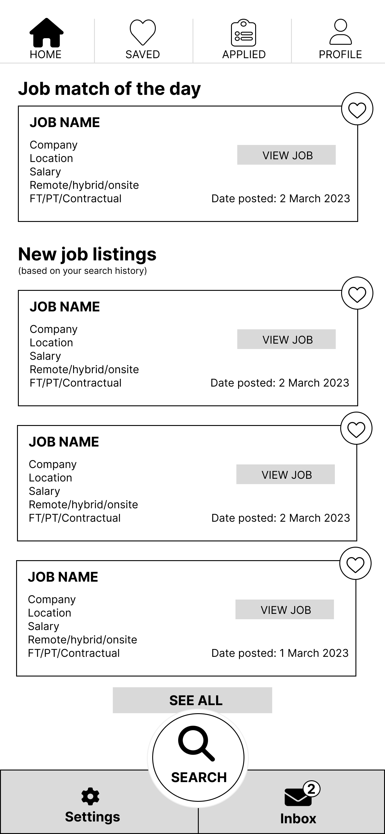
Paper Wireframes (App)
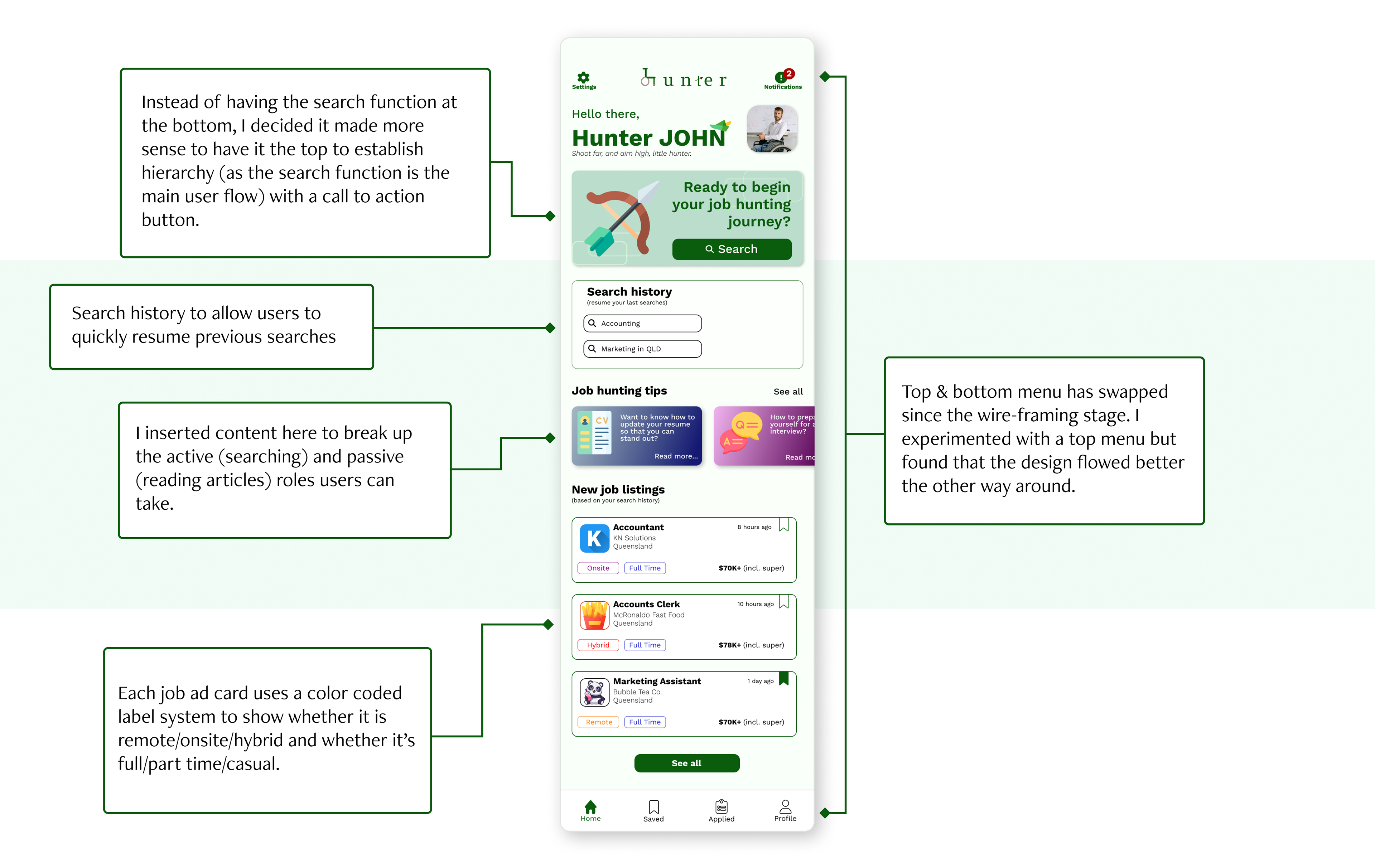
The homepage includes top and bottom menus for easy navigation throughout the app, displays new job listing cards with vital information about the job and the search function is made to stand out.
I also wanted to experiment with a menu at at the top as I have never designed one before.
I also wanted to experiment with a menu at at the top as I have never designed one before.

Low-Fidelity Wireframes (App)
The main user flow I implemented include using the search function to type keywords/location (with the choice of applying accessibility and job filters to help refine search) > browsing the job ad list > submitting an application for the job offer.

--------------------------
REFINING THE DESIGN
High-Fidelity Prototype (App)
Low-Fidelity Prototype (Website)
After finishing the high-fidelity design for the app version of Hunter, I started on the website version. I had to think about how to structure the website because it is on a bigger screen and has a top menu (vs bottom navigation on apps).
I’ve included the search function on the same page so users can easily search on the homepage (as opposed to a call to action button on the app) and I’ve also inserted “Popular Job Categories” & “Popular Employers” sections to give the website more content. Users can also sign up for Hunters newsletter at the bottom by entering their email.
I’ve included the search function on the same page so users can easily search on the homepage (as opposed to a call to action button on the app) and I’ve also inserted “Popular Job Categories” & “Popular Employers” sections to give the website more content. Users can also sign up for Hunters newsletter at the bottom by entering their email.
Another major structural difference I’ve included in the website version is presenting information in a 2-column format. This is notably seen in:
Job ad list - users can quickly browse through job advertisements and move onto the next on instead of clicking back & forth between pages (which can be disruptive to the user flow and can make users lose track of which job advertisement they are up to).
Application process - users can have the job advertisement displayed throughout the entire application process for reference purposes.

High-Fidelity Prototype (Website)
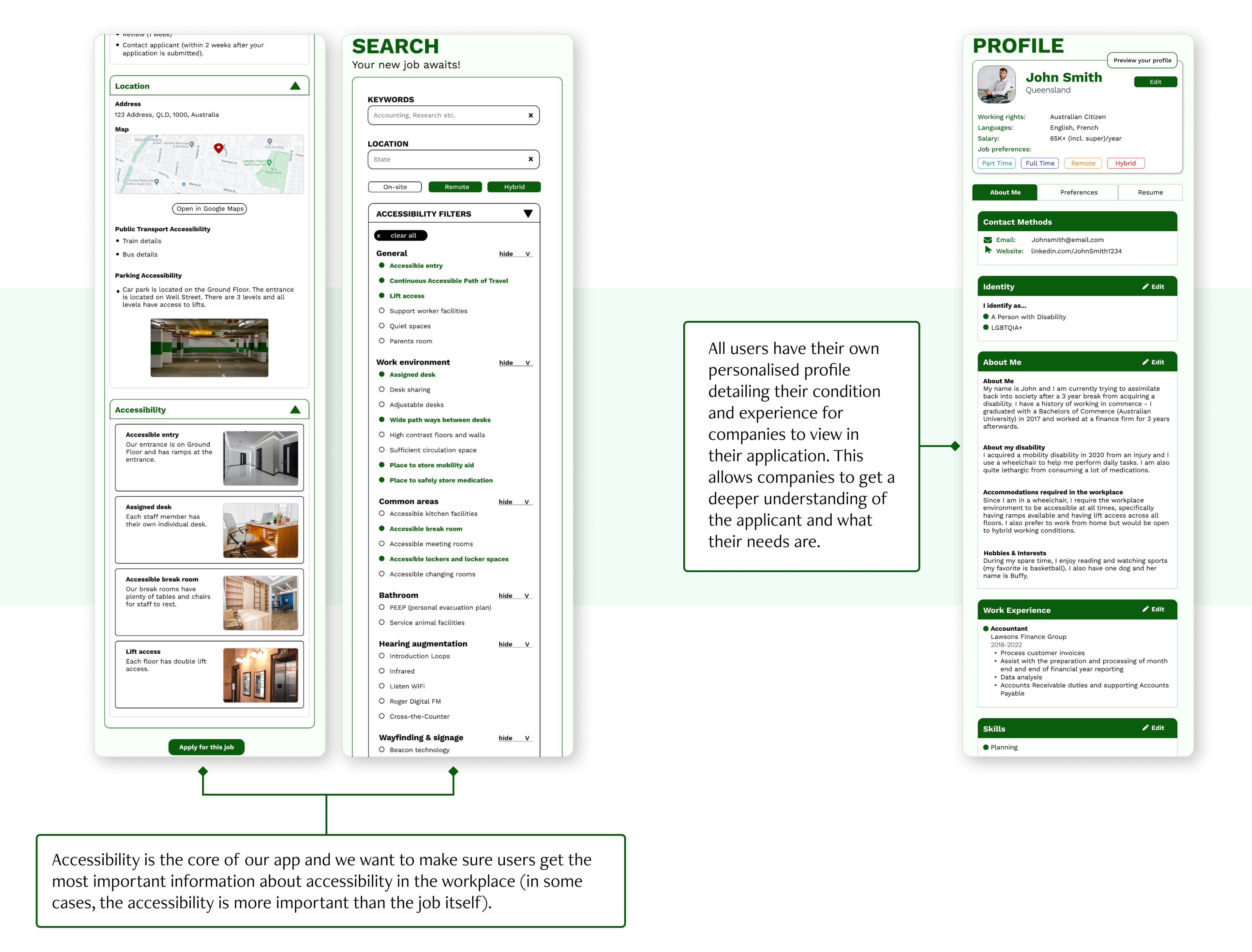
Accessibility Considerations
Accessibility Settings: Both website and app have accessibility settings that cater towards users and their different needs (vision, physical & motor, hearing & neurodivergent). Users have more freedom to customize the website/app so they can use the platform comfortably.
Readability: Both website and app colour choices were decided via an accessibility colour tool to ensure the readability of text passed the Web Content Accessibility Guidelines.
Iconography: Icons are labeled to help users who use screen readers navigate throughout the website.
--------------------------
Thank you for viewing!
To view a detailed version of this case study that includes 2 personas, completed competitive audit & research plan, please click the button below.